

Have you ever fallen in love with a paint color online, only to see it look completely different on your walls? You’re not alone.
SW Accessible Beige has become one of the most requested colors in interior design, but here’s what might surprise you, despite its name, this isn’t actually a beige at all. It’s a refined warm gray that can shift dramatically depending on your lighting and surrounding colors.
If you’ve been considering this popular shade for your home, you’ll want to understand exactly how it behaves in different conditions.
The undertones can make or break your design vision, and getting it right the first time will save you both time and money on your painting project.
What is Sherwin-Williams Accessible Beige?
Don’t let the name fool you. SW Accessible Beige is actually a warm gray with subtle green-gray undertones, not a true beige color.
This creates confusion for many homeowners who expect a creamy, sand-like tone based on the name alone.
The color earned its “beige” label because it can appear more beige-like under warm lighting conditions.
However, in natural daylight or cooler artificial light, you’ll notice its true gray nature with those distinctive green undertones.
This chameleon-like quality is what makes the color both popular and tricky to work with.
Understanding this distinction is crucial before you commit to painting entire rooms. What you see as beige in the store might read as gray once it’s on your walls at home.
Can Accessible Beige Work in Every Home?
The honest answer is no. This color isn’t a one-size-fits-all solution. Your home’s specific conditions will determine whether SW Accessible Beige looks amazing or falls flat.
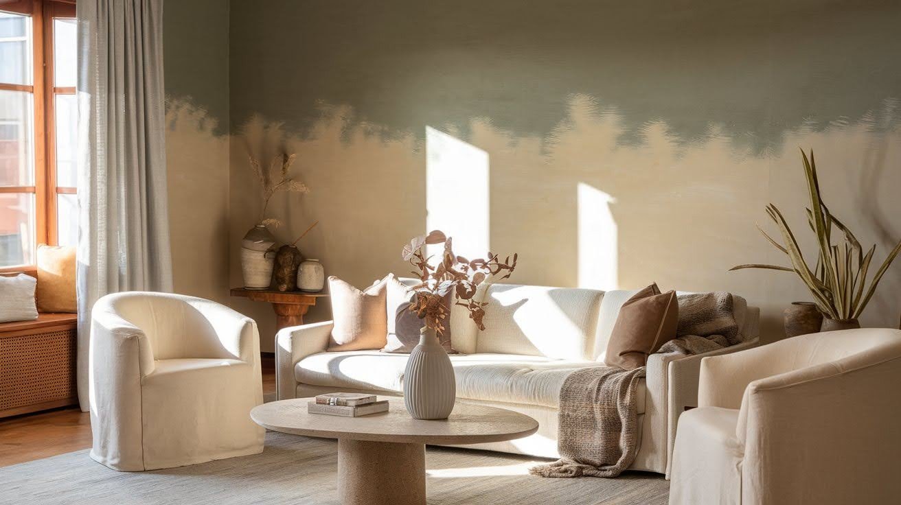
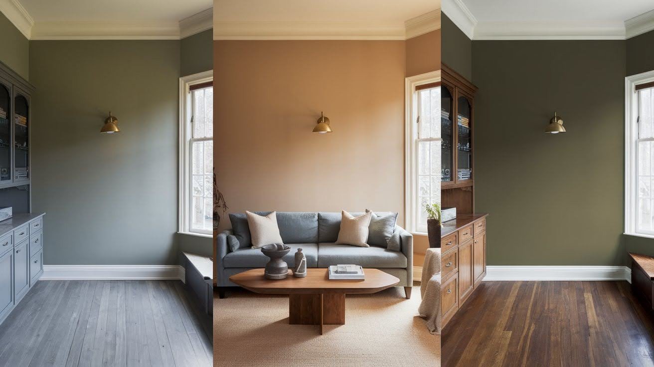
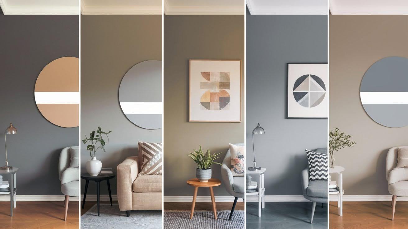
Lighting plays the biggest role. Natural light brings out gray tones, while warm artificial light makes it appear more beige. Dim or small spaces can make the color look muddy.
Your existing elements matter too. Cool-toned cabinets or flooring might clash with this warm gray. Homes with warm wood tones and brass fixtures see better results.
Room size also impacts the final look. Large spaces handle the color differently from small rooms. Consider how it will flow throughout your home before committing to this shade.
Understanding the Undertones of Accessible Beige
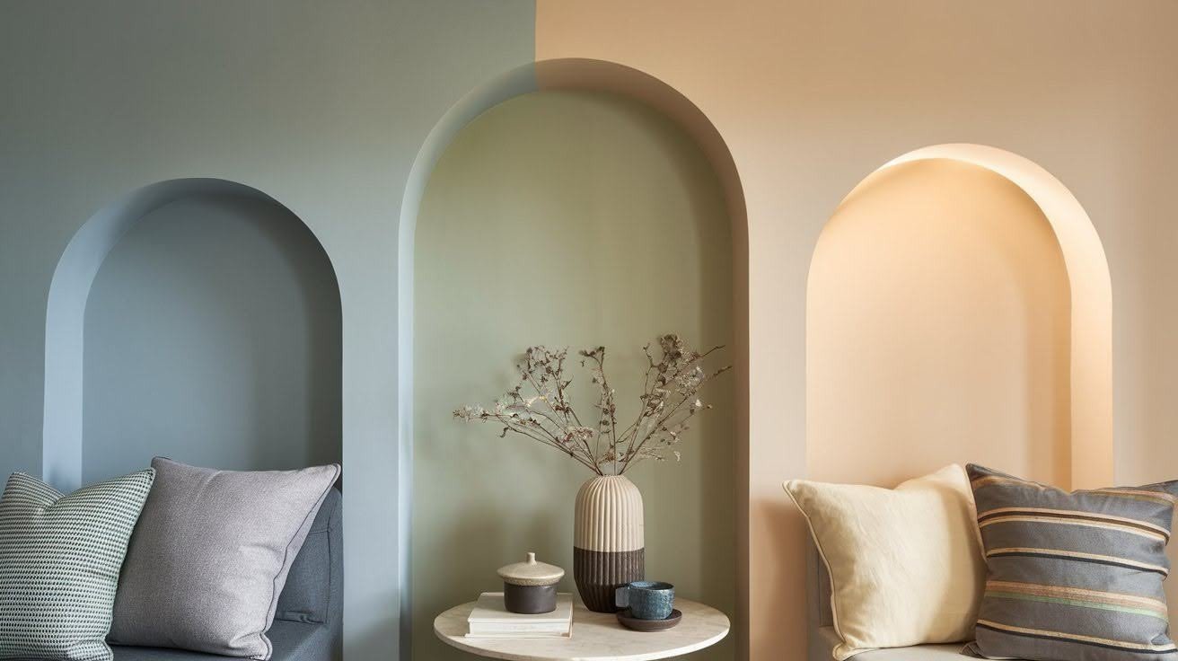
The secret to SW Accessible Beige lies in its green-gray undertones. These subtle hints of green are what give the color its warmth and make it feel inviting rather than stark.
Many people miss these undertones completely until they see the paint in different lighting conditions.
This color acts like a chameleon in your home. Pair it with cool blues or grays, and it will lean more toward its gray side.
Surround it with warm creams and browns, and those beige qualities come forward. The green undertones help bridge the gap between warm and cool palettes.
Understanding this shifting nature is key to making the color work for you. Some days your walls might look more gray, other days more beige.
This isn’t a flaw in the paint. It’s exactly how the color was designed to behave. Once you accept this quality, you can use it to your advantage in creating a cohesive color scheme.
Accessible Beige vs Similar Paint Colors
Choosing between similar warm grays can feel overwhelming. Here’s how SW Accessible Beige compares to other popular options to help you make the right choice.
SW Modern Gray 7632
SW Modern Gray is lighter and cleaner than Accessible Beige. It has similar green-gray undertones but feels more crisp and contemporary. If you want something softer and warmer, stick with Accessible Beige.
SW Agreeable Gray 7029
SW Agreeable Gray runs darker and cooler overall, though it’s actually warmer than Accessible Beige in certain lighting. This contradiction makes it tricky to predict how it will look in your space.
SW Skyline Steel 1015
SW Skyline Steel offers deeper green-gray tones but can read as a cool gray in rooms with limited light. It’s a bolder choice than Accessible Beige but might feel too dark in smaller spaces.
BM Shelburne Buff HC-28
BM Shelburne Buff leans toward gold-beige undertones instead of green-gray. This creates a completely different feel from Accessible Beige, so test both if you’re torn between warm directions.
SW Sundew 7688
SW Sundew brings yellow undertones to the mix. While still in the warm gray family, it feels more golden than Accessible Beige’s green-influenced warmth.
Design Tips for Using Accessible Beige
- Prime Your Walls: Always use high-quality primer, especially over dark or cool colors. Without it, the underlying color can muddy Accessible Beige and throw off its undertones.
- Don’t Cut Paint Colors: Never dilute Accessible Beige with white. Altering the formula makes undertones unpredictable, and you’ll end up with an unexpected color.
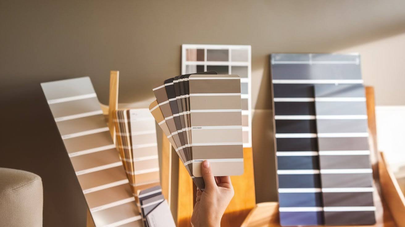
- Test Samples in Your Space: Paint large patches and observe them throughout the day. Check how it looks under natural light and your artificial lighting after dark.
- Pairing with Other Elements: This color works best with warm, earthy tones like honey wood, brass fixtures, and cream trim. Cool blues and stark whites make the green undertones look muddy.
Best Rooms & Applications
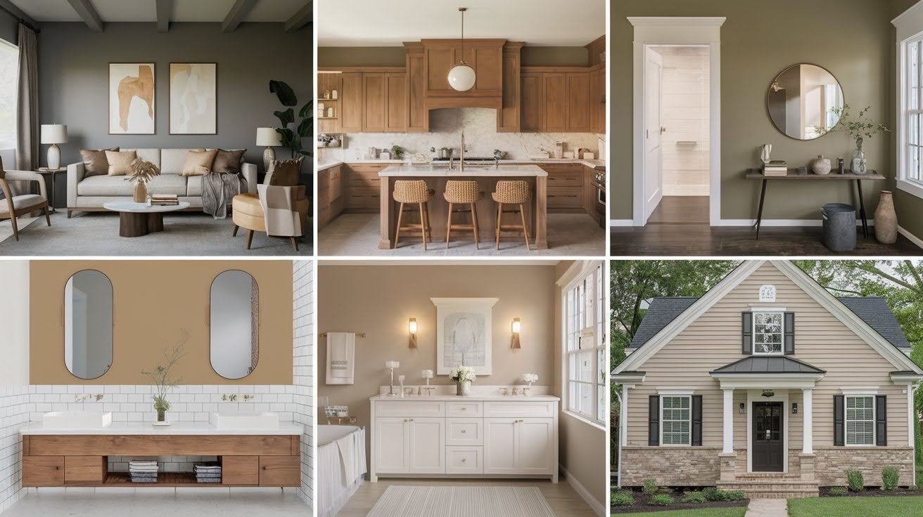
SW Accessible Beige works in many spaces, but some applications are more successful than others. Here’s where this versatile warm gray truly shines.
Interior Spaces
This color performs well in living rooms and bedrooms for a warm, neutral backdrop. Kitchens with warm wood cabinets see great results. In bathrooms, it creates a calming atmosphere with white fixtures.
Exterior Applications
Accessible Beige works well on siding, trim, and front doors. It complements brick or stone accents and holds up against various roof colors.
Lighting and Space Considerations
Large rooms with natural light show off the color best. In smaller or dim spaces, it can appear flat. North-facing rooms make it look too gray, while south-facing spaces bring out its warmth.
Common Mistakes to Avoid
Even experienced decorators can stumble with SW Accessible Beige. Here are the most frequent mistakes that lead to disappointing results.
Poor Lighting Conditions
Many people choose this color based on well-lit paint stores or bright online photos. They forget their actual room lighting. Dim spaces or cool LED bulbs make Accessible Beige look dull. Always test in your specific lighting first.
Ignoring Existing Fixed Elements
Cool-toned granite or gray cabinets can clash with this warm gray’s green undertones. Take photos of your existing elements next to paint samples before you commit.
Cutting the Paint
Never mix Accessible Beige with white paint to lighten it. This changes the formula and makes undertones unpredictable. You’ll end up with a muddy color that looks nothing like the original.
Why Consider a Color Expert
Choosing the right paint color feels overwhelming, especially with a complex shade like SW Accessible Beige. Sometimes the smartest move is getting professional help before you start painting.
A color expert can save you from costly mistakes like painting entire rooms only to hate the result.
They understand how different lighting conditions affect colors and can predict how Accessible Beige will look in your specific space.
Jacob Owens Design Services offers both online packages and in-person consultations for interior and exterior color selection.
Their expertise takes the guesswork out of choosing colors that work with your home’s unique conditions.
Final Thoughts
SW Accessible Beige remains one of the most requested paint colors for good reason. This warm gray offers incredible versatility, shifting between beige and gray tones depending on your lighting and surroundings.
However, its chameleon nature means it won’t work in every space or with every design scheme.
The key to success lies in understanding your home’s specific conditions. Test large samples on your walls and observe them throughout the day.
Consider how your existing elements will interact with those subtle green undertones. Don’t rush this process.
If you’re still unsure after testing, consulting with a color professional can save you time, money, and frustration.
Remember, the right paint color should make you smile every time you walk into the room. Take the time to get it right.
Frequently Asked Questions
Is SW Accessible Beige actually beige or gray?
Despite its name, Accessible Beige is actually a warm gray with green-gray undertones. It can appear more beige-like under warm lighting conditions, but its true nature is gray.
Does Accessible Beige work in small rooms?
Small or dim rooms can make Accessible Beige appear flat or muddy. It performs best in larger spaces with plenty of natural light to show off its complexity.
What colors pair well with Accessible Beige?
This color works best with warm, earthy tones like honey wood, brass fixtures, and cream trim. Cool blues and stark whites can make the green undertones look unpleasant.
Should I use primer when painting with Accessible Beige?
Always use a high-quality primer, especially when painting over dark or cool colors. Without proper priming, the underlying color can muddy the paint and affect its undertones.
Can I lighten Accessible Beige by mixing it with white?
Never dilute Accessible Beige with white paint. Altering the original formula makes the undertones unpredictable, and you’ll end up with a completely different color.